Is there a way to add on a control that just adjusts a single axis? I am assuming there is a way and I just haven’t figured it out.
I have a polynomial graph that has dynamically generated bounds (based on features of the function) for ymin and ymax. My goal in creating this dynamic range was to be able to see:
- the y-intercept
- All local extrema
- Comfortable padding above and below the x-axis to be able to see end behavior
Most of the time, the scheme that I’ve worked out is pretty good. However, I’d like a way to be able to have the user just scale the y-axis as or zoom in and scale just around a root as needed. Sometimes there are parts of the graph that are really squished around the x-axis and it is hard to tell what the function is actually doing at the roots. Conversely, sometimes the slope is so steep that it can be hard to tell if the graph is increasing or decreasing.
I have other elements in my activity that update based on the values of the ymin and max, so I am not sure if this would even be possible with the way my activity is built.
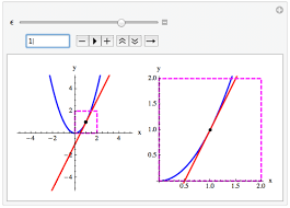
Polynomial Graphing Activity
The new addControls feature doesn’t currently support changing axis limits, so you’d need to create such controls manually.
You probably want to be able to change the xScale or yScale of the graph dynamically. It turns that didn’t work either, so I just released a new dev version of DoenetML to enable this. You’ll need to go to Settings and select version 0.7dev at the bottom for this example, below, to work. If you’ve used 0.7dev recently, you’ll need to either clear your browser cache or a wait a day or so for it to work. If nothing works when you attempt to change xScale or yScale, it probably mean you don’t have the updated version.
Assuming you have the newest 0.7dev version activated, then you could change xScale or yScale like this:
<graph name="g">
</graph>

<slider bindValueTo="$g.xScale" from="2" to="20">
  <label>xScale</label>
</slider>

<mathInput>
  <label>yScale</label>
  $g.yScale
</mathInput>
If, on the other hand, you want to instead change the min or max value of the x or y-axis, then you could instead reference one or more of $g.xMin, $g.xMax, $g.yMin, or $g.yMax.
I see what you mean - the last bit of the activity on determining local behavior is hard to see on the big graph.
What jumped into my mind is how local linearity is typically illustrated in texts.
What if I mini graph or a side by side graph showed up when a selection is being made for each intercept? Maybe this happens in stages where
- the student commits to local behavior for the leftmost intercept first,
- that gets copied over to the next graph by way of a restricted domain so the student can see what their graph would look like so far,
- then they move on to the next intercept and so on.
As one progresses, two side by side graphs show up - one which shows a global view and one that shows a zoomed in local view.
Once everything is correct, the overall graph shows up.
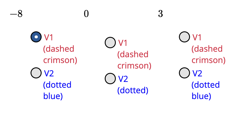
Edit: Check out <updateValue> and the attribute triggerWhenObjectsClicked. You might be able to display a little graph to the side when a student clicks on an intercept to select either the dashed or the dotted line. Clicking the intercept could bring up the graph around the intercept where an embellished (even if not accurate) saddle, cross, bounce behavior could be shown.
Some other activity specific thoughts…
-
Depending on your goals/when I steal this, I’d love to see a question before the bulleted list that asks students what parts of the leading coefficient does one need to look at for more information…(a) The LC is even means…(b) The degree is even means…(c) The LC is positive means…(d) The degree is positive means…select all that apply. In my classes, that’s the part students tend to mix up. Whenver I provide them with the scaffolding for the LC being either negative or positive, they are less likely to make a mistake. Come to think of it, the above could be accomplished by added negative, positive, even, odd as the choices to both answers. Then students have to know what choice goes with what term. Yeah, scratch the multiple choice idea above.
Would it be too mean for this to be graded all at once to discourage random guessing from the drop down menu (which would likely happen whenever I give my students multiple choice questions without restricted attempts)?
-
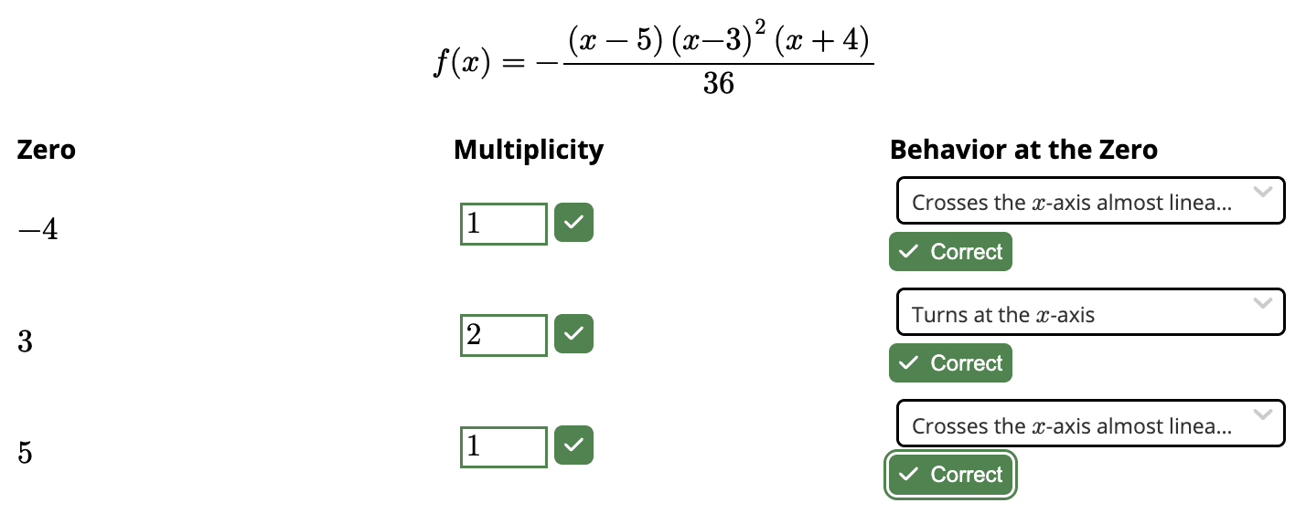
The part where one needed to reposition the arrows for end behavior gave me some trouble. I thought I was placing them correctly but kept getting it marked incorrect. Do P_1 and P_2 need to be close enough to the x intercepts on the far ends? Once I got the answer correct, I kept moving the arrows around and rechecking and the far away arrows kept getting graded correct even though they were incorrect earlier. I like the way it’s implemented. I am just scared that a student on the fence might choose the correct orientation of the arrows but the exact placement might lead to it being marked incorrect.
-
This table just visually irks me given how well laid out and balanced the rest of the activity is. Would the transpose look better?